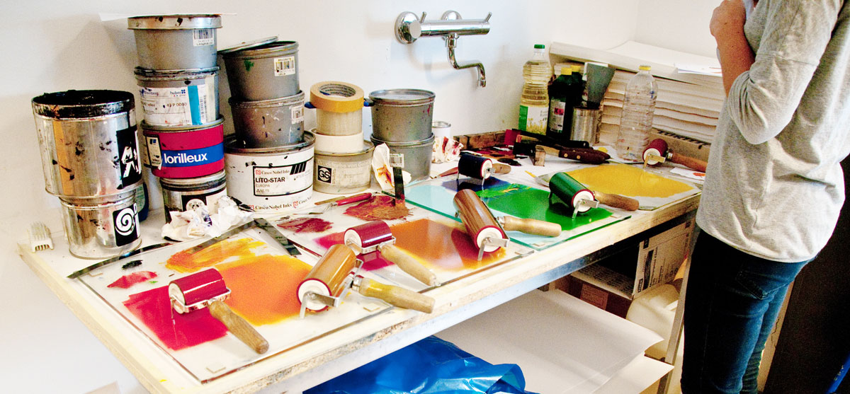
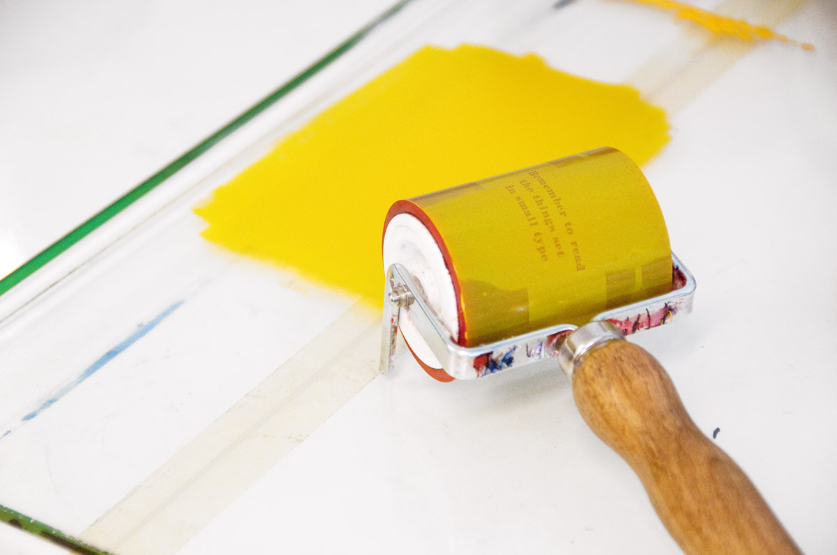
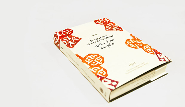
Various smaller projects and experiments
Type of work: Graphic design / posters, postcards, experiments
Date: 2012
Below you will find a selection of letterpress printed materials; some were printed on a Gutenberg-style screw press, others on a Vandercook press, and some were created using small letters of lead, others using large, wooden letters. I have experimented with different ways of working with colours; transparent colours, ways of applying and mixing colours as well as ghost printing. First and foremost, letterpressing (as any other analogue technique) is a dialogue with the material; an exploration of what the tactile way of working can contribute to the final design.
When letterpressing even the simplest things, it gets a touch of something. I particularly love the effect of ghost printing, and the variety and unpredictability that it brings.
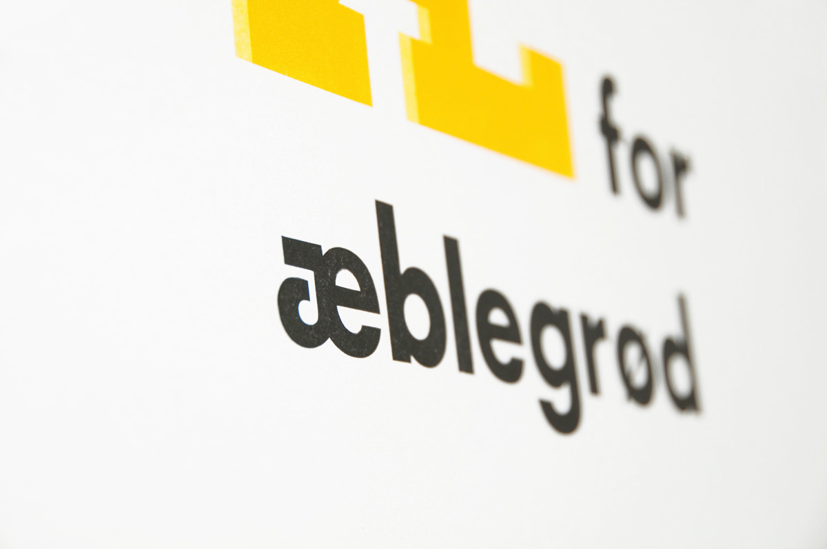
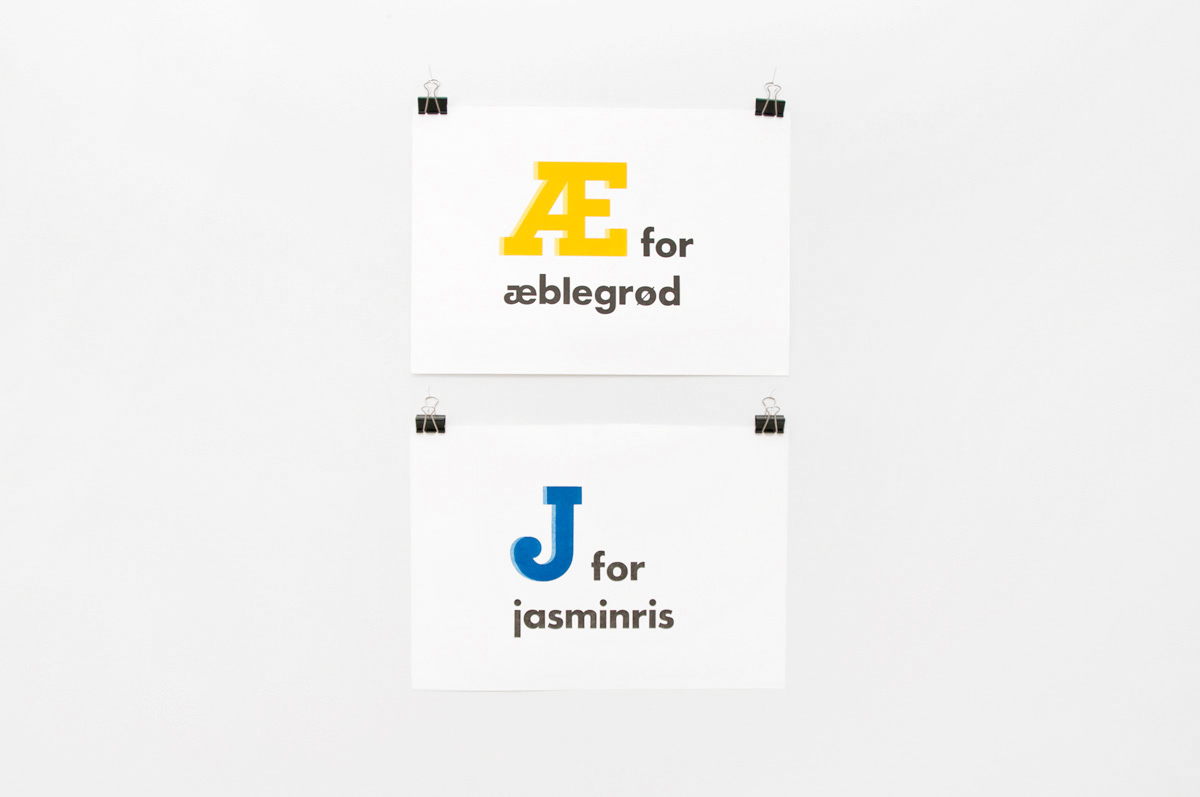
Æ for æblegrød [A for apple porridge].
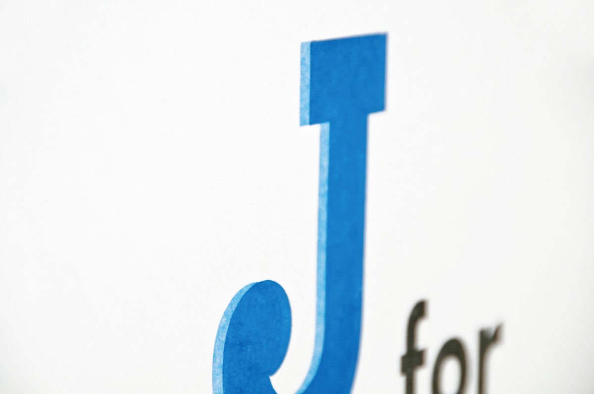
J for jasminris [J for jasmine rice].
Inspiration for a kitchen wall.
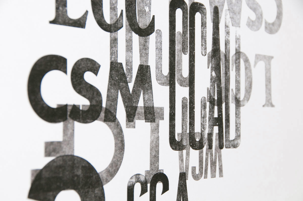
Ghost printing in black and white.
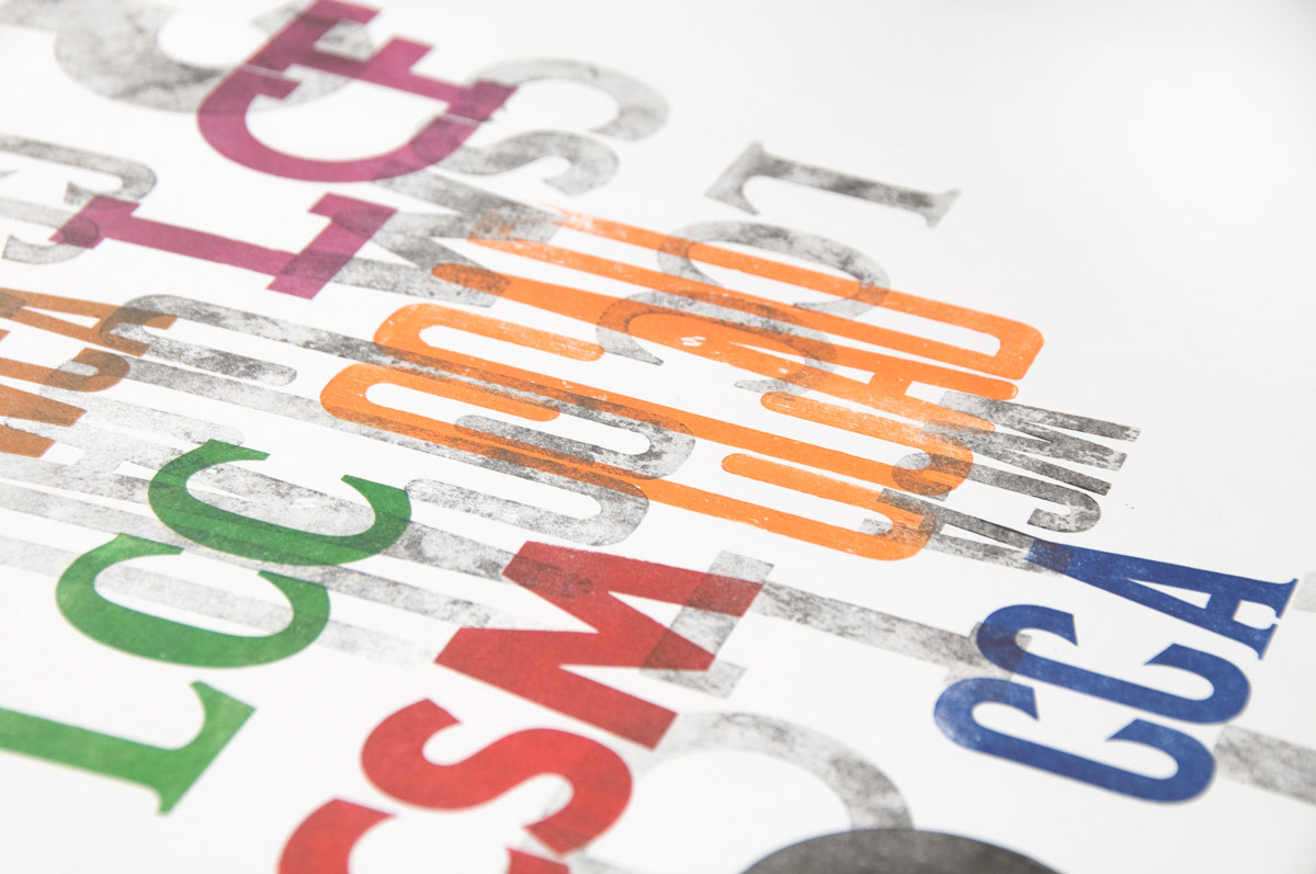
Ghost printing the same message (turned 180 degrees).
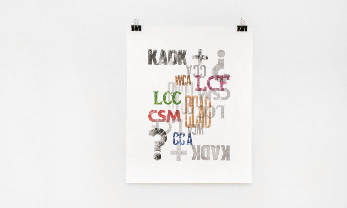
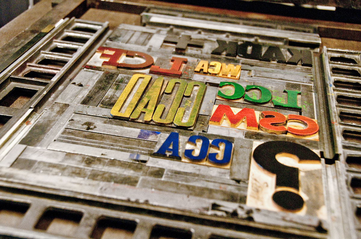
A poster advertising for studying abroad at one of UAL's art institutions (made specifically for KADK, the Royal Danish Academy of Fine Art, Schools of Design, Architecture and Conservation).
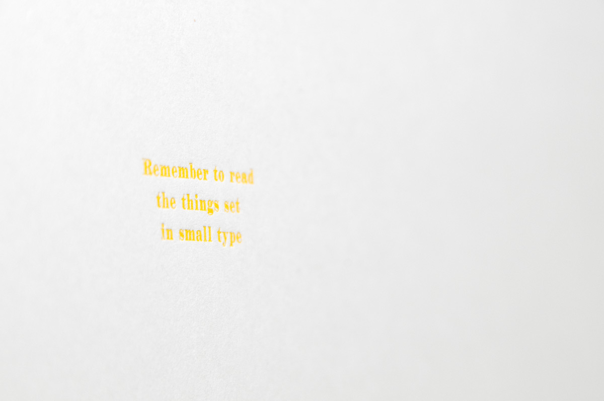
As the letters are physical, I find that you pay more attention to size and format. As here; a rather tiny set type on a very big poster.
Digital typefaces have lost their tangible touch. Although the digitisation brings other wonderful things with it, we have lost this inspiring tactility. I often find that the process of letterpressing influences — sometimes even changes — the design if you allow yourself to experiment with it.