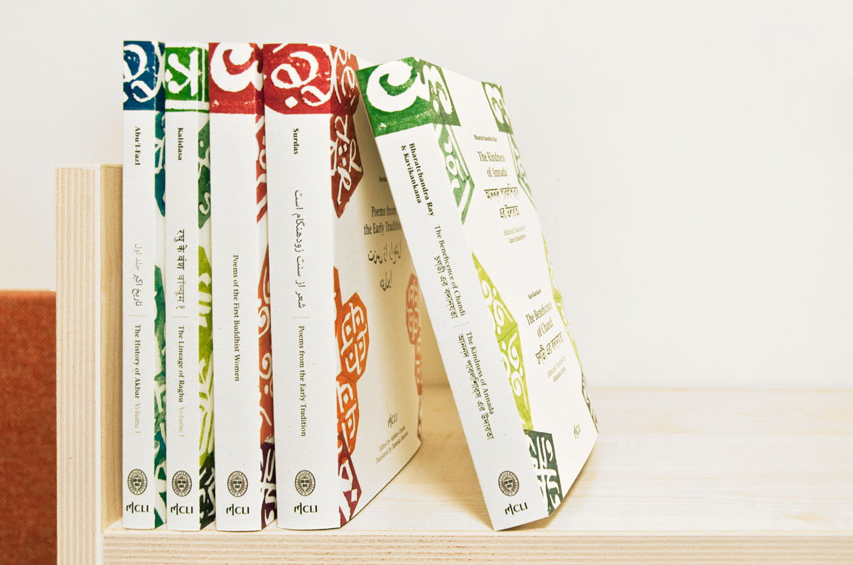
Bilingual, Indian book covers
Title: English is not Hindu
Type of work: Graphic design / concept for a series of book jackets
Date: October 2011
Extent of the project: 2 weeks, full-time
English is not Hindu and should not be treated as such. And vice versa. So how can the two languages support and supplement each other? In collaboration with Shani Armon, I designed a system of book covers for a series of bilingual books. The books — for which the covers are designed — are publications of classical Indian literature written in English as well as in the original text’s script.
Inspired by letters as forms and Indian ornamented block printing, we created a visual system of book covers. The underlying idea is that the patterns indirectly tell you which Indian script the book is written in. The colour of the cover refers to the literary genre of the book.
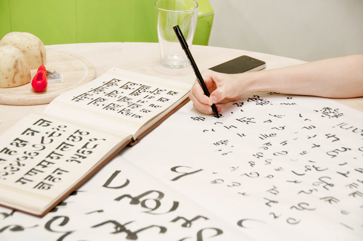
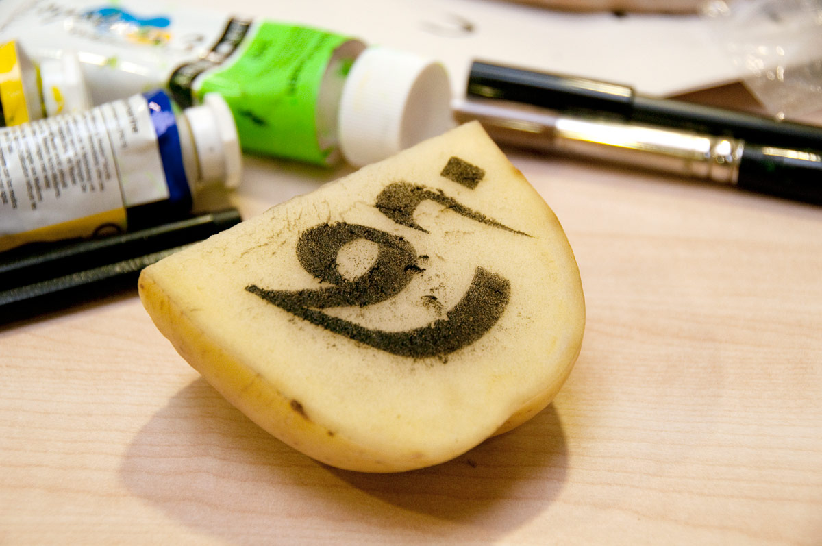
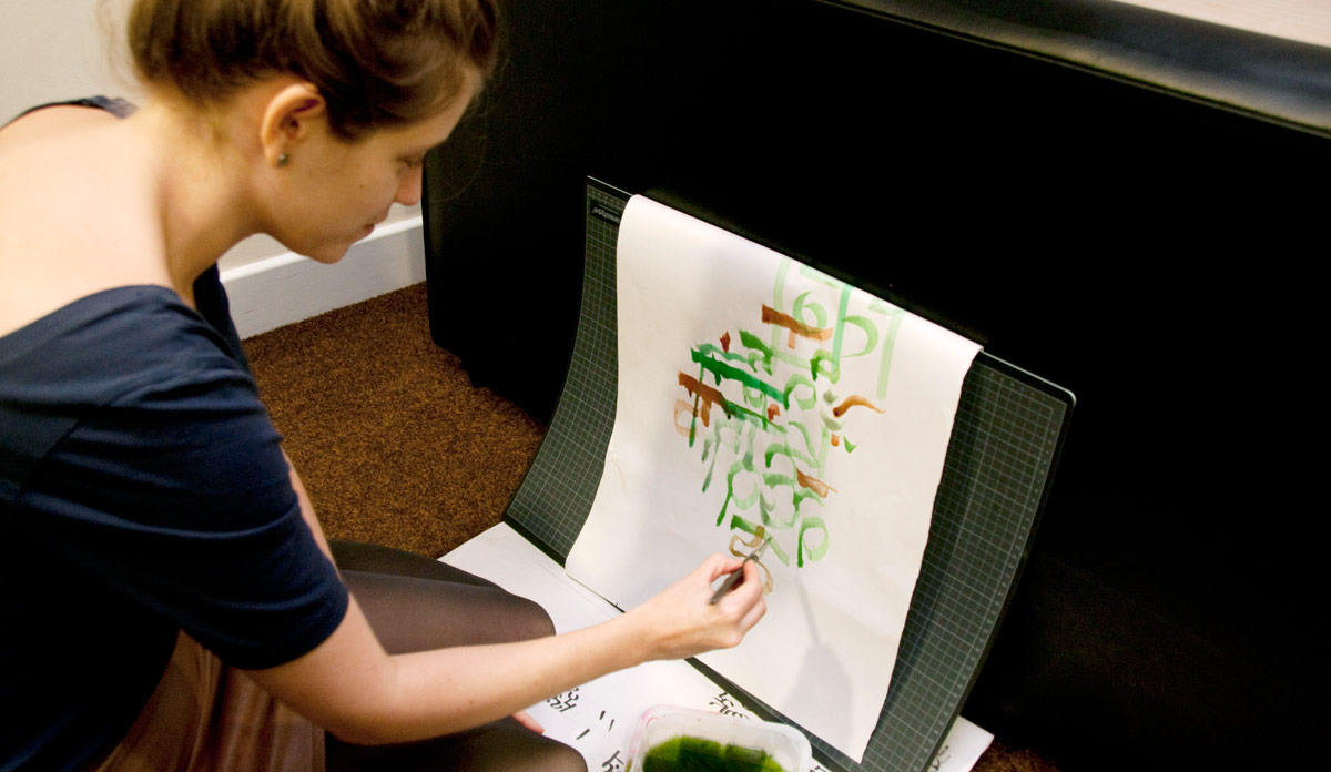
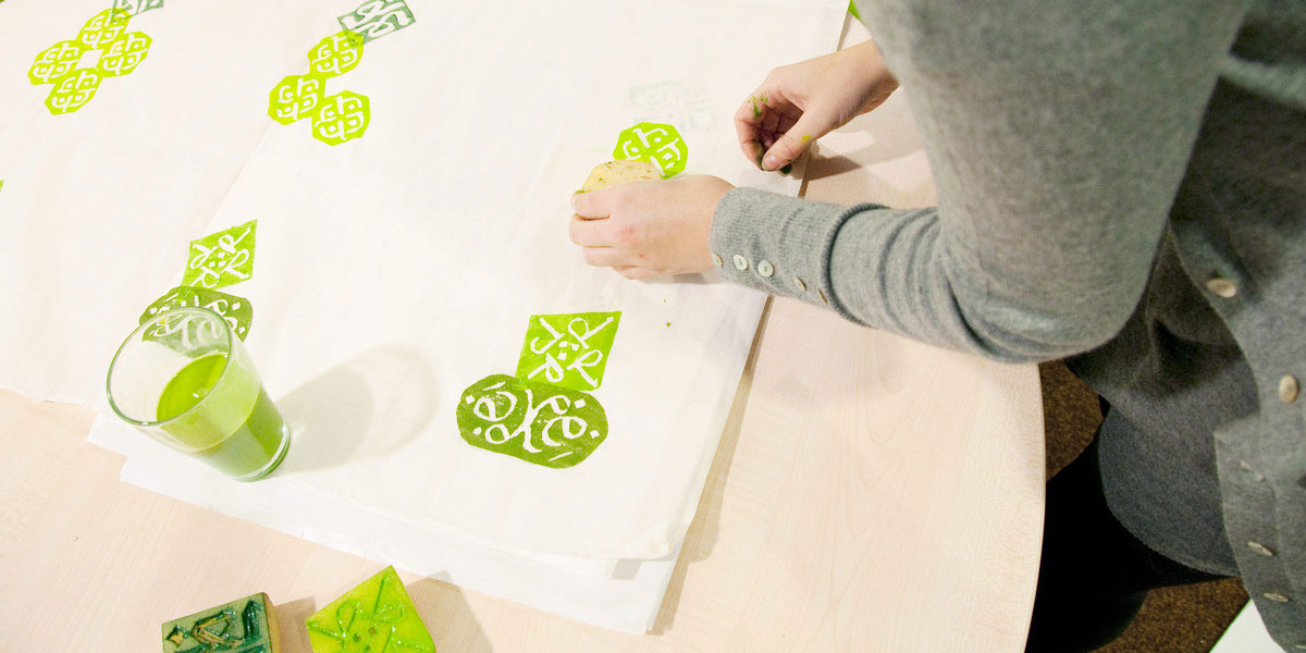
Instead of using traditional floral and abstract patterns, we created a new set of symbols based on the different Indian scripts. Each pattern element on the covers is constructed from bits and pieces of the alphabet in which the book was originally written, such as Bengali or Persian.
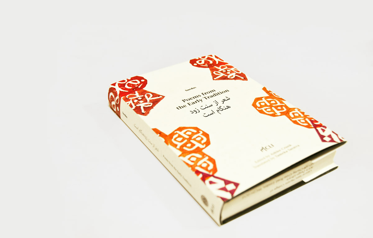
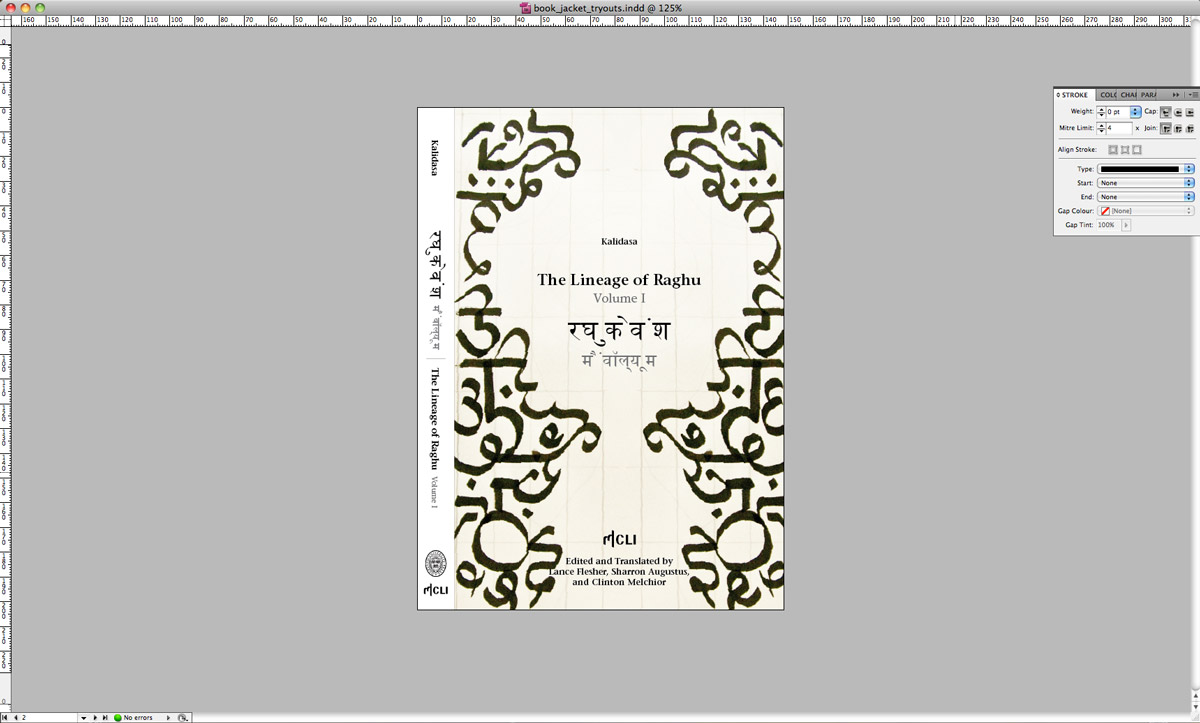
An example of a book jacket for a poetry book in Persian.
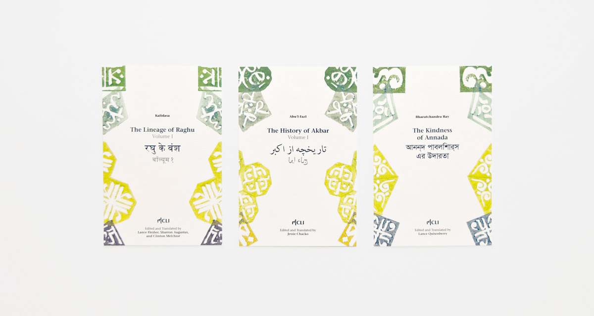
The patterns change depending on which script the text originally was written in.
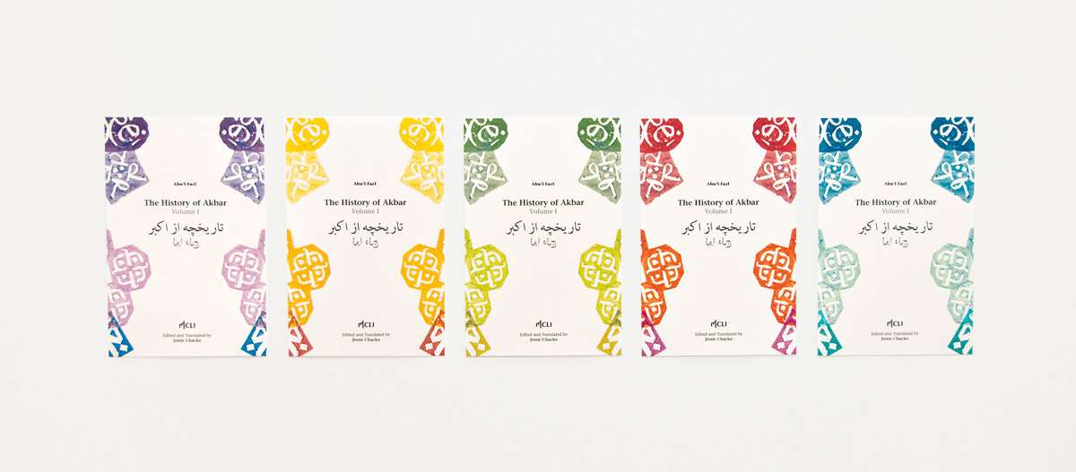
The colours change depending on the genre of the book.
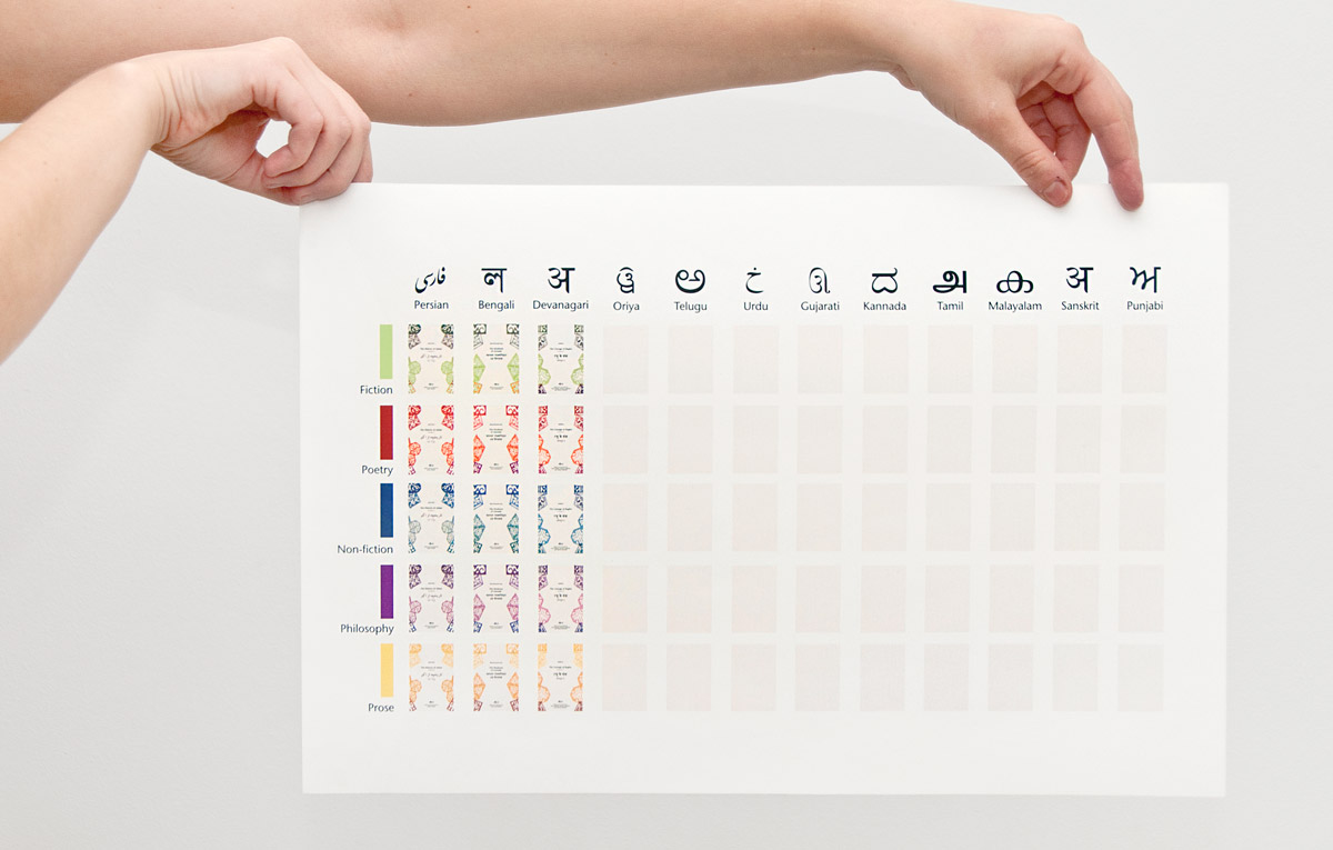
Our system creates a wide variety of covers, more precisely 60 different book jackets — when dealing with the 12 different written languages used in India and five literary genres — which are still recognisable and consistent.
Our design is a result of a collaborative, graphic experimentation with type: Working with a language which you do not read nor speak, opens up for working with each letter as a visual image rather than as a representation of meaning. The visual style of the covers is a Western take on Indian patterns and wood block printing; this process reflects the traditionally handcrafted, tactile nature of life in India.
First step on our way was getting to know the scripts through practicing writing and familiarising ourselves with its forms.
We experimented with a variety of different ways to make patterns from type, Sometimes it had other visual connotations.
The reference to block printing and its tangibility was so important that we decided to actually block print the patterns.