Få Fingrene i Kunsten

A how-to art book for children

About the project

Title: Få Fingrene i Kunsten
Type of work: Graphic design / book layout
Date: Published in December 2013
Extent of the project: 10 months, on-and-off

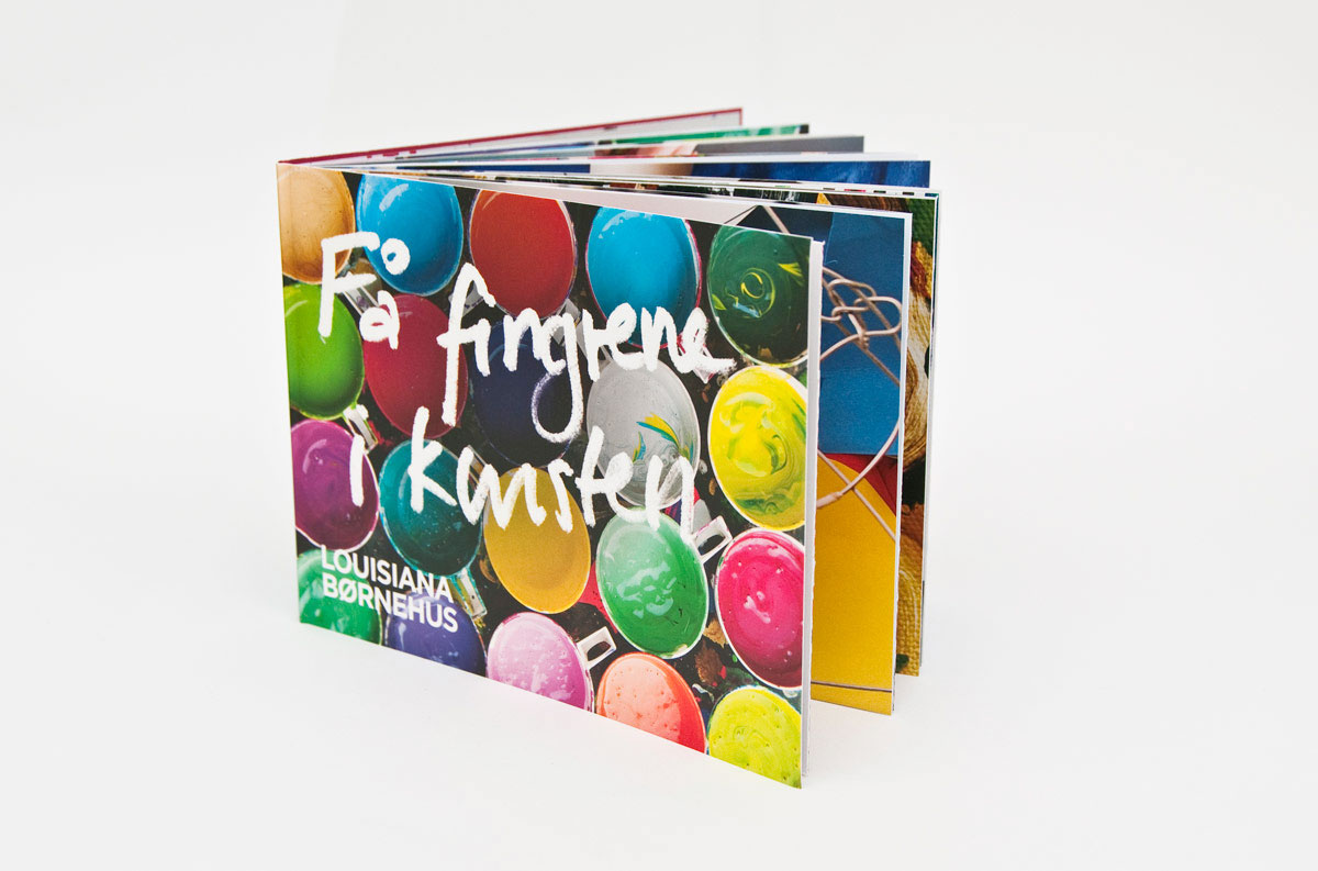
The title of this children’s book translates into ‘get your hands in the art’. And that is essentially what this book aims at: To get children to take part in art; both intellectually as well as practically. I designed the book for Louisiana Museum of Modern Art along with graphic designer Marie d’Origny Lübecker, in collaboration with the in-house publications department and the Children’s Wing. Louisiana was founded on the principle that art is for everyone, and this newly published book aims at making art relevant to children. Learning about art should be an exploration.

The design

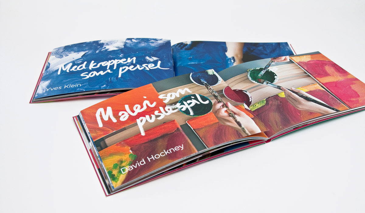
The book is divided into six ‘chapters’ each dealing with a piece of art from the Louisiana Collection; Klein, Hockney, Calder, Jorn, Richter, and Armleder. Every ‘chapter’ begins with a hand-written headline and a full-spread close-up photo of children engaged in creating their own version of the artwork.

The system of the book is to constantly alternate between how-to guides and art history made relevant for children. The books are hand bound so that some of the pages can be ‘opened up’; introducing a do-it-yourself guide for children explaining how to make your own artwork using the same techniques as the artist. If the reader — instead of opening the ‘activity flap’ — turns over the page, the chapter’s given piece of art and technique is explained in a lively and down-to-earth language.
Faa Fingrene i Kunsten The chapter pages

These are examples of the 'chapter pages' introducing a new piece of art, and its technique.
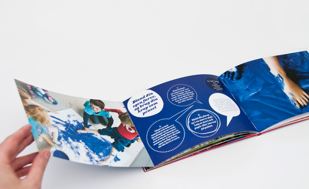
The activity flap

If you open the 'activity flap' you'll find a how-to guide to making your own art using the same technique as the artist in question.
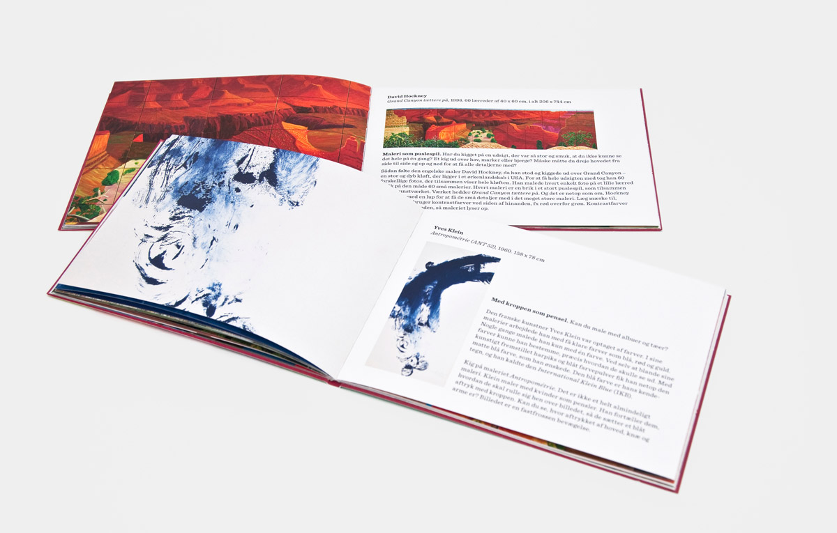
The art history pages

If you instead turn the page, you can read about the given piece of art.
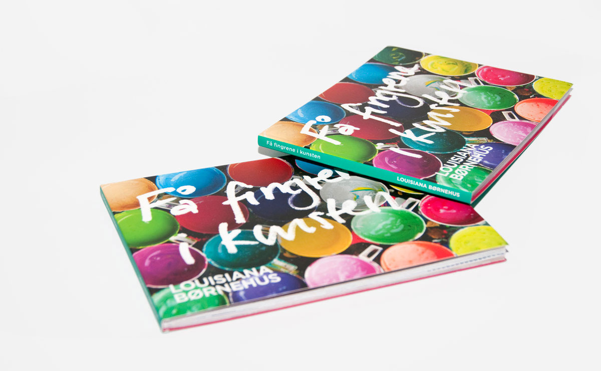
The books

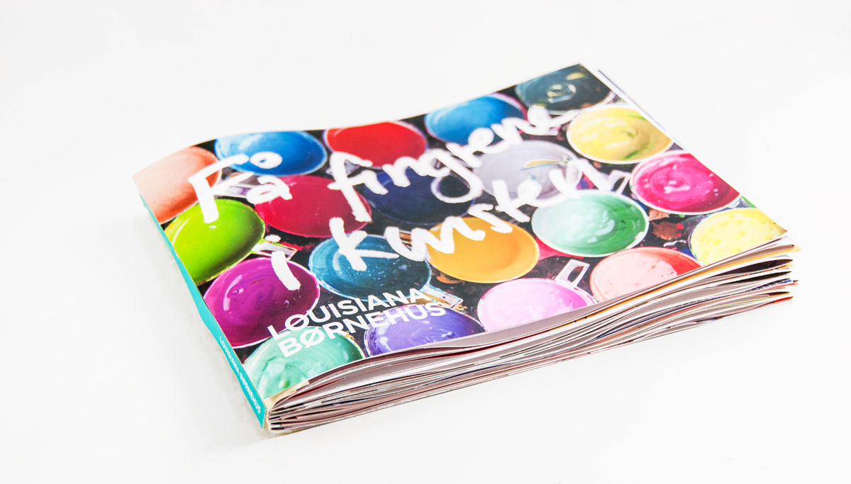
This is intentionally a very colourful book, and the colours’ flow throughout the book has been considered carefully in the design.
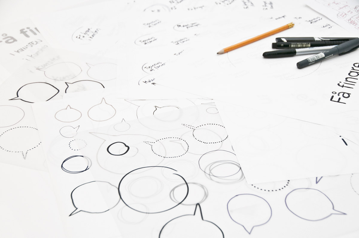
A glimpse of the process

The graphic language is tactile to emphasise and encourage hands-on activity. This is mixed in with the sharpness of computer graphics and the clean photographs to give it a balanced feel. The books are all hand bound as the 'activity flaps' didn't allow for a standard binding method.

Sketches by hand

A glimpse of the many sketches and hand-written titles that were scanned to be mixed in with digital graphics.

Dummy

One of the later (somehow clunky) dummy book versions.